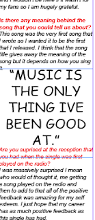
here is a section of the article that i have wrote and it shows the readers that the interview was done in a style so that it seems as if the interviwer is present as the questions that were asked are clearly marked in red and the resonses in black. In the article i have enlargened a quote from the interviewee and this is known as a quote insert and the benfits of this are that it makes it look more professional and eaasy to read for my audience
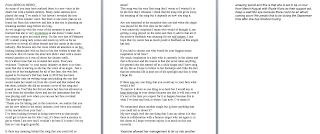
here is the article that i have wrote to go onto my DPS. This has been wrote in microsoft word and then transported into inDesign. The article is a good length and doenst have too many subject changes as this could confuse the readers. The length of the articles means that when it is on inDesign i will have to have 3 columns so that i can fit it all on.
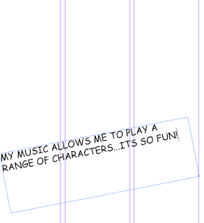
here this shows how i have looked at professional amagzines and have seen that the majority of them on the DPS have a three column set up. I chose to follow this so that my magzine could be seen as more professional and more appealing. Originally i was only going to do two columns but the length of my article showed me otherwise. Three columns means that my readers can ready my article in length and see it clearly at the appropriate font size of ten. The writing that i have going acrosee the middle is the text that will go over the top of the image that i choose to have on the DPS, i just put it here so that it is clear that i am able to use many tools that are available on inDesign. Also it gives the reader a summary of what the article is going to be about in the words of the interviewee/artist.
 here is a section of the article that i have wrote and it shows the readers that the interview was done in a style so that it seems as if the interviwer is present as the questions that were asked are clearly marked in red and the resonses in black. In the article i have enlargened a quote from the interviewee and this is known as a quote insert and the benfits of this are that it makes it look more professional and eaasy to read for my audience
 here is the article that i have wrote to go onto my DPS. This has been wrote in microsoft word and then transported into inDesign. The article is a good length and doenst have too many subject changes as this could confuse the readers. The length of the articles means that when it is on inDesign i will have to have 3 columns so that i can fit it all on.
  here this shows how i have looked at professional amagzines and have seen that the majority of them on the DPS have a three column set up. I chose to follow this so that my magzine could be seen as more professional and more appealing. Originally i was only going to do two columns but the length of my article showed me otherwise. Three columns means that my readers can ready my article in length and see it clearly at the appropriate font size of ten. The writing that i have going acrosee the middle is the text that will go over the top of the image that i choose to have on the DPS, i just put it here so that it is clear that i am able to use many tools that are available on inDesign. Also it gives the reader a summary of what the article is going to be about in the words of the interviewee/artist.
No comments:
Post a Comment