Friday 24 February 2012

Screen shots of production on contents page

This is where i was deciding on which font that i was going to use for the band that i have created for my contents page. The website i used was www.dafont.com and this is where the image is from. I knew i wanted the font to be quirky and different to any that i had previosuly used in this piece. The image shows that i have typed in the text that i want to use and this gives me the impression of how the text will look in each of the fonts, also it gave me a better impression of how it would look on my magazine.

here is the way that i am going to set out the contents of my pages on my contents page, i have looked at many music magazines to see what their layout is and this is the one that i liked the look of best and this was a one that was similar to the one from the magazine called 'Q' i followed this layout so that it would look professional, smart and easily readable. This way it shows that i have stuck to a colour theme of red and black and this is what it remains as for the whole of my magazine.
here is how i have decided the layout to my contents page. i decided to use three columns for my set up as i knew that i was going to include some writing so it would allow me to use the correct spacing that the professional magazines use. here i have uncluded everything that i thought i would need to include such as the name of the magazine, band name, columns, page numbers and page name which is everything that is included in a selling magazine.

Screen shots of production on front cover


here is the image that i originally took with the camera and it is the image that i was going to originally use as the front cover image. However i changed my mind for many reasosn mainly that the background looks more crean than white and it doenst look to good on my cover also there is a shadow behind the model and it doent look professional so it would need to be edited which could make it look better.


this is the same image once i had edited it. I have been told that it looks more appropriate like this as before the model looked really young but putting the image in black and image allows the readers to look beyond the model. Also the image looks professional when it is like this. I had to do some editing in the facial features of the model as i decided that i wanted some of the features to be the original colour of the models such as the eye colour and lips so i highlighted these areas and made sure that these werent editied. In the case of the eye colour i made the colour look a bit bolder, i made a mistake in not putting red lipstick on the model as it would of looked amazing if she had it on as the lips would stand out, but a natural colour still goes well it just doesnt stand out as much,
This shows the style model that i have used as my professional magazine cover to copy from. The way that i have do this is to do a similar masthead however to make it different i have changed the colour and the style of my text and its layout. O have also added a yellow shape on the right hand side and have added my main sell line in the same place and all of this gave me a guide line of where the rest of my text needed to go. By having a professional magazine alongside mine it allowed me to see where i was going right/wrong.

Screen shots of production on DPS

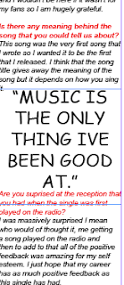
here is a section of the article that i have wrote and it shows the readers that the interview was done in a style so that it seems as if the interviwer is present as the questions that were asked are clearly marked in red and the resonses in black. In the article i have enlargened a quote from the interviewee and this is known as a quote insert and the benfits of this are that it makes it look more professional and eaasy to read for my audience

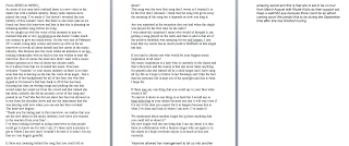
here is the article that i have wrote to go onto my DPS. This has been wrote in microsoft word and then transported into inDesign. The article is a good length and doenst have too many subject changes as this could confuse the readers. The length of the articles means that when it is on inDesign i will have to have 3 columns so that i can fit it all on.

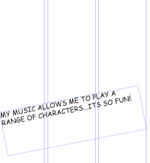
here this shows how i have looked at professional amagzines and have seen that the majority of them on the DPS have a three column set up. I chose to follow this so that my magzine could be seen as more professional and more appealing. Originally i was only going to do two columns but the length of my article showed me otherwise. Three columns means that my readers can ready my article in length and see it clearly at the appropriate font size of ten. The writing that i have going acrosee the middle is the text that will go over the top of the image that i choose to have on the DPS, i just put it here so that it is clear that i am able to use many tools that are available on inDesign. Also it gives the reader a summary of what the article is going to be about in the words of the interviewee/artist.

Thursday 23 February 2012

Article Draft 1

From ZERO to HERO:

As some of you may have realized there is a new voice in the charts but with a hidden identity. Many radio stations have played the song ‘I’ve made it’ but haven’t revealed the true identity of this wonder voice. But there is one more plan as we found out from this interview and that is that she is planning on releasing another song before too long.
As we caught up with the voice of the moment in pop we realized that she is very mysterious as she doesn’t make much eye contact to give too much away. On the very day of February 23rd a small young lady comes and meets up with us for an interview to reveal all about herself and her career in the music industry. She breezes into the room whilst all attention is on her, looking immaculate with no fault to her she wishes to start the interview. But of course the interview didn’t start with a music related question as it was all about her chosen outfit.
So it’s about time that we revealed her name. Everyone welcome ‘Yasmine’ to your music industry as there is no time soon that she is leaving as she has the voice of an angel.  Just a quick bit of her background for all of her fans: she was first signed to Universal’s Def Jam back in 2010 but has been focusing her time on writing songs and picking the one that would make her stand out from the crowd and that indeed she has done, initially she did an acoustic cover of her song and posted in on YouTube but did not show her face but allowed us to see from the shoulder down and see the instrument that she was playing until now when you can see her face overleaf.
The interview begins:
‘Thank you for taking part in this interview, we realize that you are the new talent in the music industry, how have you reacted to the reaction from your fans’…
I’ve been looking forward to doing interviews so that people could get to know me for who I am, it’s been such a journey to get to where I am now and I wouldn’t be here if it wasn’t for my fans so I am hugely grateful.

Is there any meaning behind the song that you could tell us about?
This song was the very first song that I wrote so I wanted it to be the first that I released. I think that the song title gives away the meaning of the song but it depends on how you sing it.

Are you surprised at the reception that you had when the single was played for the first time on the radio?
I was massively surprised I mean who would of thought it, me getting a song played on the radio and then to add to that all of the positive feedback was amazing for my self esteem. I just hope that my career has as much positive feedback as this single has had.

If you had to choose one who would be your biggest music inspiration of all time?
My music inspiration is a lady who is currently in the charts and that is Beyonce and the reason is that she never takes anything for granted also she started off as a child singer and I have sung all my life so I hope to follow in her footsteps and I like the fact that her personal life is kept out of the spotlight and this is what I hope for.

If there was any one thing that you could say to your fans what would it be?
To narrow it down to one thing is so hard but I would say to keep believing in your dream because one day it will true even if it’s not at the time you expect for it to happen because this is what I’ve done and look at where I am now. I’ve made it!

We mentioned about another single but is there anything that you could tell us about it?
My new single well the one thing that I can say about it is that there is collaboration with a famous singer who yet again is in the charts so I hope everyone enjoys it as much as this one currently.

Yasmine allowed her management to let us into another amazing secret and this is that she is set to be on tour from March-August with Rizzle Kicks as their support act.
Keep a watchful eye because there could be an album coming soon! We predict this to be during the September time after she has finished touring.

Research and development of Journalism

There are a variety of sources that i have looked at which have given me inspiration of how to construct my interview for my DPS and the main place that I have look at is in magazines which are available to purchase in all shops such as LOOK, Heat, Closer and OK!. The reason that i looked at other magazines was to look and see how they construct their articles as some people relate to some more than others. I have found that many people prefer to have a question and answer interview as it shows how the audience are able to engage with the artist.
There are a variety of questions that I wish to ask, such as things to do with their background and whether it was coincidence that they have ended up here or whether this was their and how their background has influenced them. I also wish to ask about the music that they have out at the moment as many people will want to know about it especially their fans and these are the people that will purchase this magazine. I will also ask if there is anything that they can tell us about what they have planned for the future.
There is an article that i find is inspirational and this is from the Daily Telegraph and features the artist Lana Del Rey and the reason that I think it is inspirational is that it gets straight to the point but stays interesting all of the way through. http://www.telegraph.co.uk/culture/music/rockandpopfeatures/9027984/Lana-Del-Rey-interview-new-album-Born-to-Die-is-a-beautiful-thing.html
Also i like an interview from MyBliss.co.uk yet again on the artist Lana Del Rey and the reaosn that i like it is that it has the same style that i am going for with question and answers and i think this is best as it will grab the attention immediately of then readers.

Tuesday 21 February 2012

Feedback For Improvements.

The feedback that i was given shows me that there was 5 areas that was assessed and that three out of the five were at level 4
  • (shotlists,layouts, layouts, drafting, scripting/storyboarding)
  • time management
  • level of care in the presentation of research and planning
however their are two areas that i need to improve on to get them up to level 4 as they are currently of level 3 and these are:

  • research into similar products and a potential target audience
  • organisation of actors, locations, costumes or props.
i was given feedback from my teachers of what i need to do to improve my work to get it all up to level 4 and in the range of 16-20marks.


  • i need to define who my target audience is
  • include images on makeup and costumes in the posts that are already created
  • add Recce to the post already made
  • how each research element is beneficial to my magazine ideas.

Monday 20 February 2012

Progress Update

There are 60 marks available for construction and 20 marks for Research and Planning and 20 marks for evaluation - 100 marks in total

To achieve a grade:

A I need to get 80 marks

B I need to get 70 marks

C I need to get 60 marks


To be in level 4 (grade A/B) my work must demonstrate excellence throughout.

By Monday 5th March I should have a rough cut of my products

By Monday 19th March my products should be completed

From Monday 19th - Friday 30th March I will be working on my 7 evaluation questions.

The my completed portfolio should be submitted for formal marking on Monday 16th April. I should use the Easter break to make any minor amendments to my work.

In order to meet these deadlines I will:
make sure that i attend each of my lessons so that i have this time to complete all of my work and will need to dedicate my free time to getting my work finished if it wasn't during class time, i will also need to make sure that i set my self deadlines of when i need certain things finished for instance i will set my self a time period to get my images completed and a deadline for each of my pages so i will have to be strict with time management, however i will go by the timetable that i created which i named 'call sheet'

Friday 10 February 2012

Becky and Nicola

i scanned my recce onto my computer in media today but i forgot to put it on my blog will do it when we get back to college

Thursday 9 February 2012

Test Shots

 this is the first image that i took and the way that this photo was took was that it was against a plain white wall however it wasn't took very professionally as there was no lighting structure that was used as the only software that i had was a camera. the pose is what i want it to look like on my front cover as i took inspiration from a magazine that i had been analysing as the genre matched. the clothing in this image isn't exactly what i will want my model to be in as the colours are very dark however this is okay for a test shot as this wont be my final model and i will be in control of the clothing. the makeup is of a style that i find interesting so i will hope to use a similar style in my final design. the pose itself looks very simple but it doesn't give an impression on the models emotions. The camera angle is of a medium close and the eye line of this image shows that the eye line is in the top third to show direct address to the reader.

 this image was taken in the photography studio with the lighting structure in progress. i chose to have three people in the image as it is how i want my contents page to look like as i am having a band on that page, the only difference that is recognisable is that there is a male in my test shot and i am not wanting one in my final image. i took the image from a height to see what it would look like in a range of shots,this looks like a good pose but it wasn't my initial idea but because the eye line is in the middle it looks like the models will be on the same eye line as the readers and this would be good as the readers don't want to think that the models are in a higher position to them. personally i think that the background is too dark on this image however when it comes to my final design i will need to make sure that i use photoshop to lighten the background as it will make it look much more professional.

 this image was taken outside and is at the location that i want it to be taken and the reasons behind taking my image here is that i could check the lighting as there was no lighting structure put in place here. the thing i would do differently to this image is that i would only focus on the top halves of the body as there is a difference in the wall and i don't want this to be vissable. the pose is how i want it as i want the tallest in the middle so that they look more dominant and the two others to be beside in a pose that is exactly the same. i would prefer the models to be closer in together but this will be something that i will check for in my final production. the thing that i would do differently to this image is that i would have the models standing face on as then it would look more professional and look more similar to my flat plans. i need to make sure that each of my models is doing the same pose as here it only looks like there are two models doing the same pose and i need them all to, to make it look professional.

 this is an image that i want my final image to look like however it isn't in the preferred location but i will show the models this image and will tell them how i want them. the models are doing a pose/stance that isn't usually shown in magazines so by doing this it will separate me from them and give me a USP.  the camera shot is showing the image as a long shot and initially i didn't want this but because my initial idea isn't realistic but this image looks professional but the only thing is that i would need to crop it as i would like it to be a medium close up and this would only require the image to be up to the waist.

 this image was my first try at using the camera however it looks very dull and the reasons behind this are that i didn't have the camera/lighting structure  set up. however the pose is what i want it to look like as the models are close to each other and this makes them look like a band. because the image itself is dark you cant really see the style of make up that they have on and this is what would catch the attention of the readers. the clothing is something that i would change as one of the models (left) has a different style to the others so she looks more 'indie' than the others and although this is good i need to make sure that they all look the same as they are representing a general music magazine.

 this image was taken at the start of the year but the thing that i like about this one is the style and the colours of the clothing that she is wearing as it shows that she is daring and isn't suited to one music genre. i will take notice of this clothing as i need my models to be in bright colours to represent their difference in the music industry and bright colours usually attract the readers attentions. the pose is something that i would change as i wouldn't know where to use this image as it just looks plain so i would need to make sure that my model was doing something other than smiling as we want the readers to be intrigued by the facial expressions shown.

Risk Assessment /hazzards


These six sheets show my hazzard evaluations of the locations that i have chosen to shoot in and shows the dangers of that location and how they can be changed. The first two images show the hazzards and risks of the outdoors where i will shoot for an image that will be placed on my front cover but will not be the main image. It shows that there are 9 hazzards which i think i will need to take into order whilst shooting with the model and i have then gone on to explain 3 of them which are the ones that i think are the most important ones that need to be considered. The second lot of images which are placed on the next line show the hazzards and risks which need to be notified before shooting and these include things such as confined spaces, costume, make up and lighting and each of these have been explained as each one will need to be remembered as for these shots they are going to be taken against a plain wall and each of these will be able to be noticed if they arent perfect.  The third lot of sheets are of the final location where i will shoot at and this will be a brick wall of the art center building and the reasons behind the choice of this location is that the images can be taken in college time and then uploaded and the fact that my models wont have to travel to the location, the risks and hazzards listed ar noise, roads, vehicles, weather and audience/public.

Recce

model release

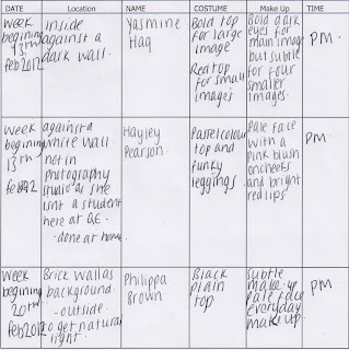
Call Sheetmodel name: Claire Harnett
character: Model
release form signed?: Yes
shooting date:Week Beginning: 20th February
location: Art Center Brick Wall
producer: Sarah Hicks
director: Sarah Hicks

Call Sheetmodel name: Fern Whittaker.
character: Model
release form signed?: Yes
shooting date:Week Beginning: 20th February
location:Art Center Brick Wall
producer:Sarah Hicks
director:Sarah Hicks

Call Sheetmodel name:  Philippa Brown
character: Model
release form signed?: Yes
shooting date:Week Beginning: 20th February
location:Art Center Brick Wall
producer: Sarah Hicks
director: Sarah Hicks

Call Sheetmodel name: Olivia Mounter
character: Model
release form signed?:Yes
shooting date: Week Beginning: 13th February
location:Outside
producer: Sarah Hicks
director:Sarah Hicks

Call Sheetmodel name:  Yasmine Haq
character: Model
release form signed?: Yes
shooting date:Week Beginning: 13th February
location: Plain Background/ Photography Studio
producer:Sarah Hicks
director:Sarah Hicks

Call Sheetmodel name: Hayley Pearson
character:Model
release form signed?:Yes
shooting date:Week Beginning: 13th February
location: Plain Wall
producer:Sarah Hicks
director:Sarah Hicks


call sheet

Wednesday 8 February 2012

Photoshoot Lighting Set-Up Plans

The above image is of a plan that i have designed that i hope my lighting structure will look like.The model will be placed in the center of the frame so that i can get the best possible image. I have decided to use a three light set up so that i can get the most amount of light to benefit the images and willallow me to not get any shadows or reflections in the background. I am not going to use a tripod to focus the image as i havent decided whether or not to use high angle or low angle shots.

Photography Analysis

I decided to look into bands and how their images are constructed and why they are distinctive and found my images on www.google.com I chose images from a variety of music genres as i need to make sure that my images cover each genre as i am a 'general' music genre.


Research into font

For my masthead i understand that this needs to stand out and the way that i have thought of doing this is to  use created fonts on the website www.dafont.com . i immediately looked through a range of fonts that would be a good idea and this was done before i knew the style of my masthead. I had an idea of the font style in my head that i wanted to use and this was that i wanted it to look funky and to make it look like it had cracks in it and the reason for doing this was to make the magazine title to stand out from designs that were already out there. A reason that i thought about designing a font was because i wanted my magazine to be distinctive from the start and this would be starting off with the masthead, so i looked at using a normal font such as 'Ariel' and the reason for looking at this was because it was simple and noticeable as people would recognise it. Dafont.com offered me a variety of fonts that i could use and the ones i looked at were zombified, insomnia and amped for evil. The design that i went for in the end was very similar to amped for evil and is called : promises broken dream by Gersan Borge A and the reason that i went for this font was that it looks funky and is definitely different from any thing that is in the industry already, i then typed in the name of my magazine to try out the font and this is what it looks like http://www.dafont.com/promises-broken-dream.font?text=surround

Research into make-up

when looking through magazines of the same genre as mine i have found that the make up designs have varied for instance in one magazine one artist has pale and subtle make up and in a different magazine with the same artist she was seen as less approachable and more bold as her make up was more noticeable, i have then found that the make up depends on what the magazine is hoping to achieve. I have then started to search for images of make up ideas on google of artists that are in the media today who are idols of people and i have found out that the make up it dependant on the costume that they are wearing because it all has to link in with each other to create an approachable image. the make up searches that i have made are of subtle make up and then some bold features and the reason for this is that i want some features to stand out and these features will vary from lips to eyes as these features can be enhanced with the use of make up as they will catch the readers attention. i went on the search engine of google and typed in the style of make up that i wanted and the features that i was looking at and it can back with many searches however at some times the searches that came back weren't what i wanted so i then looked into beauty magazines and managed to find what i wanted so all of these research documents have been saved and will be used when it comes to me taking the images in the production stages.

Research into Costume:

I have looked into many magazine front covers that are known as being 'general' and have found that the main magazine that i should base my magazine on is 'Q' and the reason for this is that it has a template that i find is easy to follow. The costumes on the front  covers of this magazine tend to be either black or white and i suppose that the benefits in this are that they will stand out when they are on the shelves. Because each if my models that i am using are females i have looked into the costumes that they are put into on the front covers and it is clear that Q want to grab their readers attentions and the way that they want to do this is by dressing the females in seductive outfits that are tight fitting and revealing. However my magazine front cover will not have these types if outfits on mainly because i will be taking the images of students and this would be regarded as inappropriate and i want my models to look natural and in full clothing mainly because this is what i want my magazine to look like.  However i have looked into another music magazine called 'kerrang' but the difference between this magazine and mine is the genre as kerrang is a rock magazine and this shows via the front cover due to the poses, make up and costume. the costume in this magazine front covers tend to be dark colours which support the genre of the magazine, the main colours that are tended to be used are blacks and 'karky' colours such as dark greens however this is based more on males, the females are usually dressed in black but some are dressed in bright colours which supports their personalities. From looking at these magazines it has given me more of an idea of what i want my models to be dressed like and i have decided that i want a mix of bright colours and dull colours and the main reason behind this is that it will keep the readers intrigued into what genre the magazine is and it will also grab their attentions.

Production Schedule

21st of February onwards I need to start and design my magazine rough cut (draft1) on Photoshop and In Design as the deadline for it is Monday March 5th

Article Drafts – Monday 27th February
I have set myself this deadline as I feel I will be able to research, plan and create a rough draft of my article for my DPS by this time and it will allow me to get my other work done as well

Photography - Friday 2nd March
I have set myself this deadline as I feel it is a reasonable length of time to get my photography done from now as i have a variety of shot locations that i need to go to.

Double Page Spread - Friday 2nd March
By this date i will have my article finished so i think it is reasonable to have the double page completed by then as all i will need to do will be to organise the page and add the images etc.
Contents Construction – Tuesday 28th February The contents page will not take too long to design as i already know how i want to design it so i think that it is a reasonable time to get it finished by.
Front Cover Construction – Tuesday 28th February
The front cover will take me a while but i think that this is a reasonable time as i want to get this finished first because i will need to dedicate my time to other thing such as photography and construction of my DPS.

Friday 3 February 2012

Article Planning

What the article will be about?
the article that i have chosen to write will be about an artist who has a new found success in her life. i am only going to focus it on an artist as then i will be able to do more research on her past and it will take less time but this will allow me to find it out in more detail. The article itself will be about how this artist has made it 'big' in the music industry and the struggles she has faced before finding her success. The article will then progress onto saying about the album release of the artist and how each of the music tracks has a meaning in her life and why these have been the ones to release and why she thinks they will sell.  the type of article that i am going to produce will start of being a story of her background but then will progress onto being a interview for the information on the tracks.

Style:
i have decided that i am going to write the article in  3rd person as it is a story of the background of the artist and this way it will allow me to exaggerate in the article and this will be what grabs the audience's attention. It will then switch to first person towards the end when i have an interview going on. However throughout the article i will have quotes that go with what has been mentioned about her background. I will be using a variety of word in article and i need to make sure that i include words that are linked to the magazine genre that i want and the reason for this is that if i use wording that is not specific then audience will be confused as to what they are reading for instance i will need to make sure that i use words such as 'gigs, album release, album,song, fashion choices' i will use wording such as this because it will link in with my genre of 'general' as any artist could be questioned on any of these. I will also need to include words that will link in with the production of the article such as the promoting of the album for instance if she has played many gigs, been a support artist or simply if she has been on the radio to promote it. I will also need to ask about how the recording went and if any of the songs that have been recorded have been acoustic. I will need to know about the venues that she has played at etc.

Beginning:
the type of introduction paragraph that i will use will be summary as this will give the audience a clear image of what the article is going to be about however i will also grab the audiences attention by having a quote to start off with then go into the summary as both of these will make them want to read on. The first paragraph that i write which will come after the introduction will need to catch the readers attention and the way on which i hope to do this will be to start of by saying about the terrible upbringing that she has and the reason that i will write about this will be because people will want to read about her and how she grew up as this has made her the person she is today i need to make it sound dramatic and i will do this by empathising the situation. I will also mention that this is the only interview that she is doing about her background and how it will only be published in this magazine and this will make it exclusive and different.

Extra text on the page:
at the end of the article i will finish off by saying if they want to read on then they can visit our website to see the full interview as some will need to be cut out to fit the page size there will also be a preview of her upcoming single. There will be a variety of other texts that i will use on the page and these will be things like the gigs that she has previously played and who she played with if she was a support act this way people will be able to recognise her if they went to that concert and they will be able to find out where she is playing next and if there are any tickets left to go and see her. The way in which i will demonstrate this text will be to put it on the page with the image and i will put a coloured border around it so they can tell how the information is important.

Thursday 2 February 2012

Mood board of Inspirational Images

each of these images are going to help me with my magazine as each of them has a significance to what my initial idea are for instance the reason i have the image of florence and the machine at the top is that the idea for my front cover will be of the model with her hand up to her face which is of a similar style to a magazine front cover that is also present(Q), some of the other images that i have got are just general ideas of something that i can encorporate into my magazine such as the image in the bottom of the right although this will take a long time to construct. I searched through many images of make up and hair that i wanted to use and i have found suitable styles that i want and by using my initial idea it shows that i can go from that and expand. I also put in their another magazine front over and to me this is inspirational although it is a fashion magazine but i prefer the layout of it and i like that vibrant colours have been used and this is something that many people would prefer so i hope to encorporate this into my idea. i also put an image of how i want my band to be standing and this idea comes from a magazine front cove which shows the most important member being centre framed this image will link in with a brick wall to creat texture and to have a change of scene.

Image Analysis & Composition

 this image comes from the music genre of R&B and is on the artist 'Kelly Rowland'this is a very popular music genre in the industry today as it is seen as very mainstream. the pose of the artist shows that she has attitude as she is not standing directly looking at the camera, this pose could represent that her music is different to what other artists are singing about. The shot distance it self looks like it is medium close up so it looks like the type of image that could be used on a front cover as the top of the shot is left blank so it could show that this space has been left for the magazine's masthead, it could also be used in a double page spread as the image is dominant and shows attitude and looks like it could have a good story behind it. The background of this image looks like it has been taken in a photography studio and there has been a system of three camera/lights to make it look this bright as the background is white which could represent the purity of the shot but the costume could show otherwise as the costume is all black and the fact that she is wearing a leather jacket could show that she has a sense of rock and roll about her. In this shot there are no props being used and this is a good thing because the image itself is striking and any props could distract the readers attention from the pose of the artist and that isn't the selling point. The facial expression of the artist shows that she is not smiling but she doesn't look angry and this could show the reader that their is something hidden about her which could allow them to want to read on about her to find it out. I would say that the angle of this shot is low angle as it looks like she is looking down at the camera but this is good as it could allow the reader to feel as if they have more power than them. The eye-line of the artist could also link in with the angle as it looks like it is at the bottom of the top third to show that she is relatable. 
This image is of the artist 'Adele' who belongs to chart music. I would say that we aren't really given an impression of her as we are aren't shown her whole body language but this could allow us to think that she isn't confident so that is why we are seeing her face only as this will always be a part of her that cant be hidden away. However the pose is of her looking over her should which could show that yet again she isn't confident although she is looking directly at the camera which could show a double barraled meaning of the shot. I would say that the shot distance is a close up as the only thing that you can see is her face which could show that this is her best feature. Yet again the lighting is of a white background which could be used to represent the fact that this image could be used on a front cover or on a banner as there is a lot of room around the sides where information could go. You cant really see to much of the costumer apart from the top of it  which shows that it 'glitzy' this could be different to what people initially think of her as they could think that she is plain looking. No props are used in the image that we can see but there could of been in the lower half of the image but we cant see this, the facial expression of this artist could show that she is misunderstood as her expression is simple but it could also be seductive. This image's angle i would say is of a slight low angle as it is not very noticeable as her eye line suggests that there is no angle because she is looking straight at the camera which could allow the audience to engage with her as she is seen as being in the centre of the shot of the rule of thirds. 

How the images have helped me: 
These images have helped me a lot because i hadn't really looked into costume of what i wanted my models to wear but these images have allowed me to think that the costume could also influence what the audience think the genre is. Different shot types that i have analysed have helped me to think about what image i take will be placed where and if there is a different style that i want to introduce for instance in an image that i chose not to analyse there was one shot but that had four smaller images inside of it and by doing this it could allow me to create more of a story through image and then i wouldn't have to include more information as the images could create the story themselves. By looking at the pose's and stances of the artists it has allowed me to think that i will have to represent different genres as i am aiming to be a general music magazine and by having different poses'/stances it will allow the audience to have an impression of what my genre is.